01
PROJECT
“La Bible de la Paella” website has been a reference for the authentic Paella recipe from Valencia. However, over the years, the website looked dated and needed a clean refresh design.
challenge
Redesign the home page ergonomy and its web design.
I chose green & yellow as primary colors to represent food ingredients, Black & white as secondary colors to contrast with the former colors.
Typography wise, I picked serif type face “Playfair Display” for headlines and titles, and “open sans serif” font used as body text.
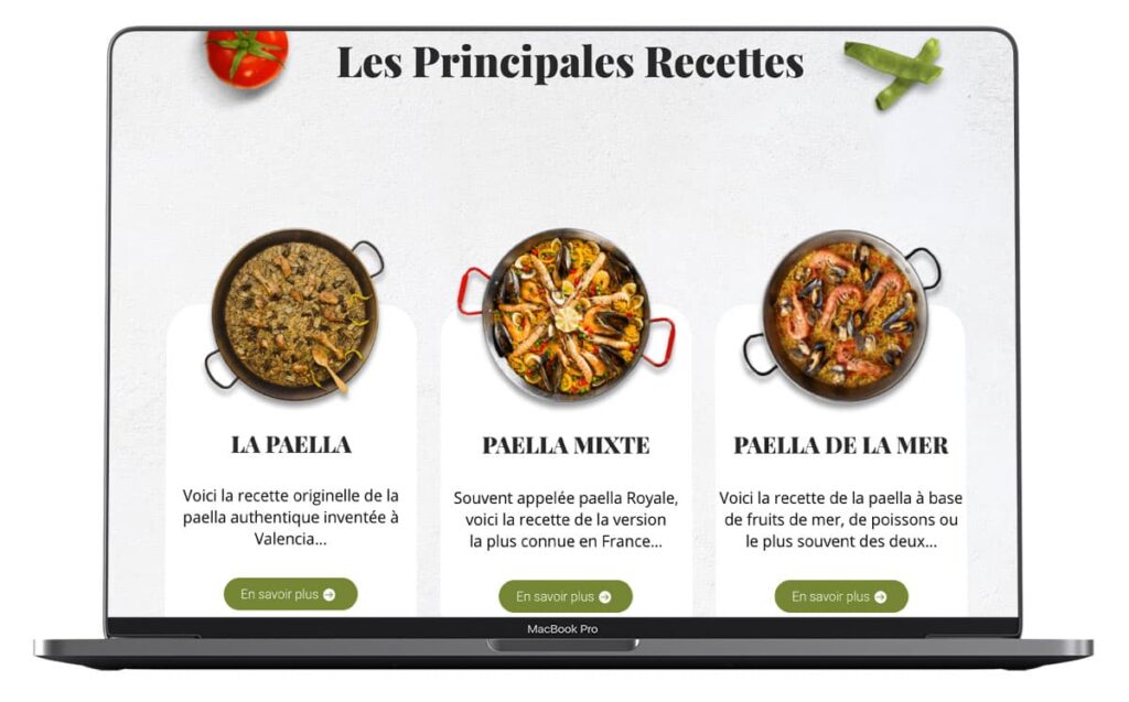
The new home page is composed of 3 main sections : “the most known Paella recipes”, “everything you need to know about “Paella”, “videos & social networks”.
After finishing the UX & UI, I integrated the page on using WordPress & Divi.