01
project
AMAOS is a cultural charity based in south of France. In order to fight against social, cultural and educational poverty, AMAOS has set up several workshops : french language classes, sewing, bookbinding, cooking class, art and culture activities & outing…
challenge
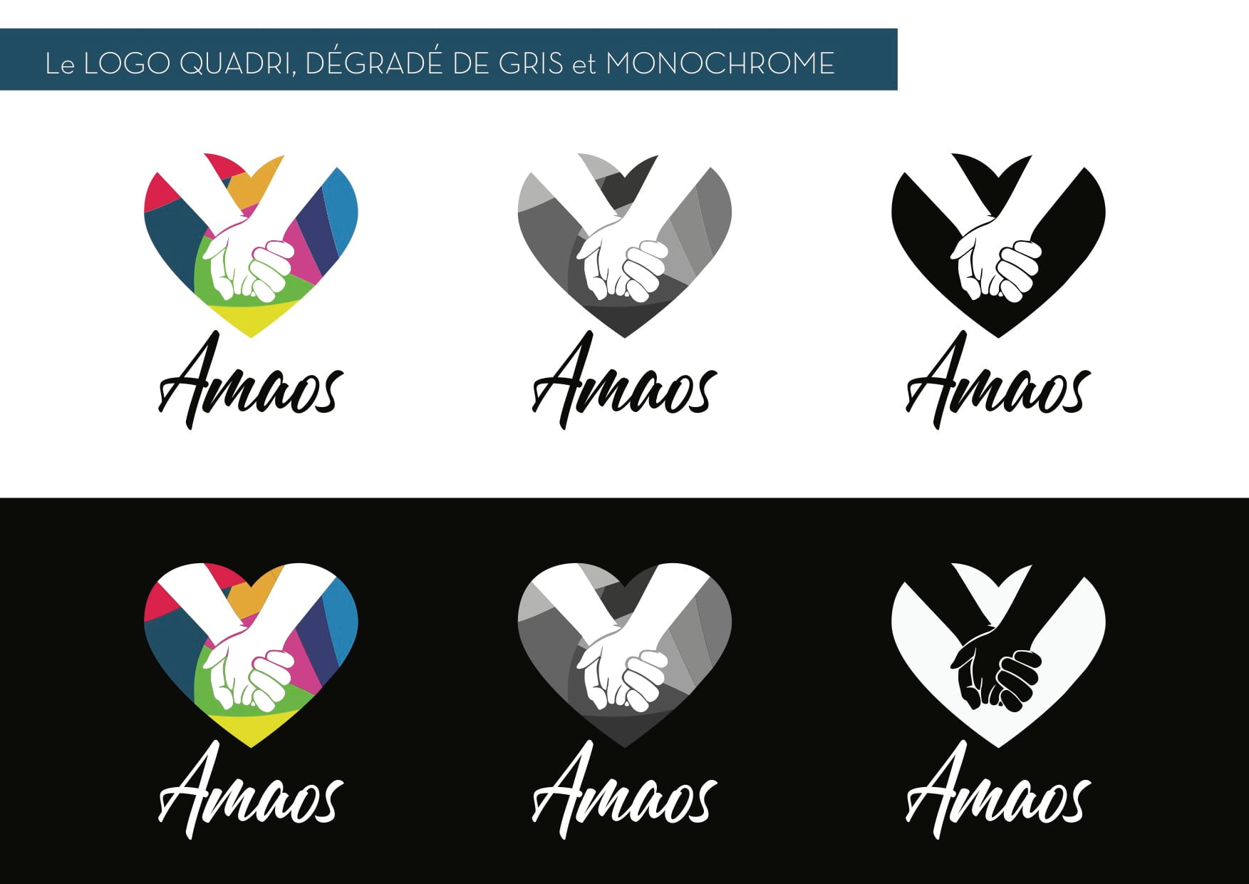
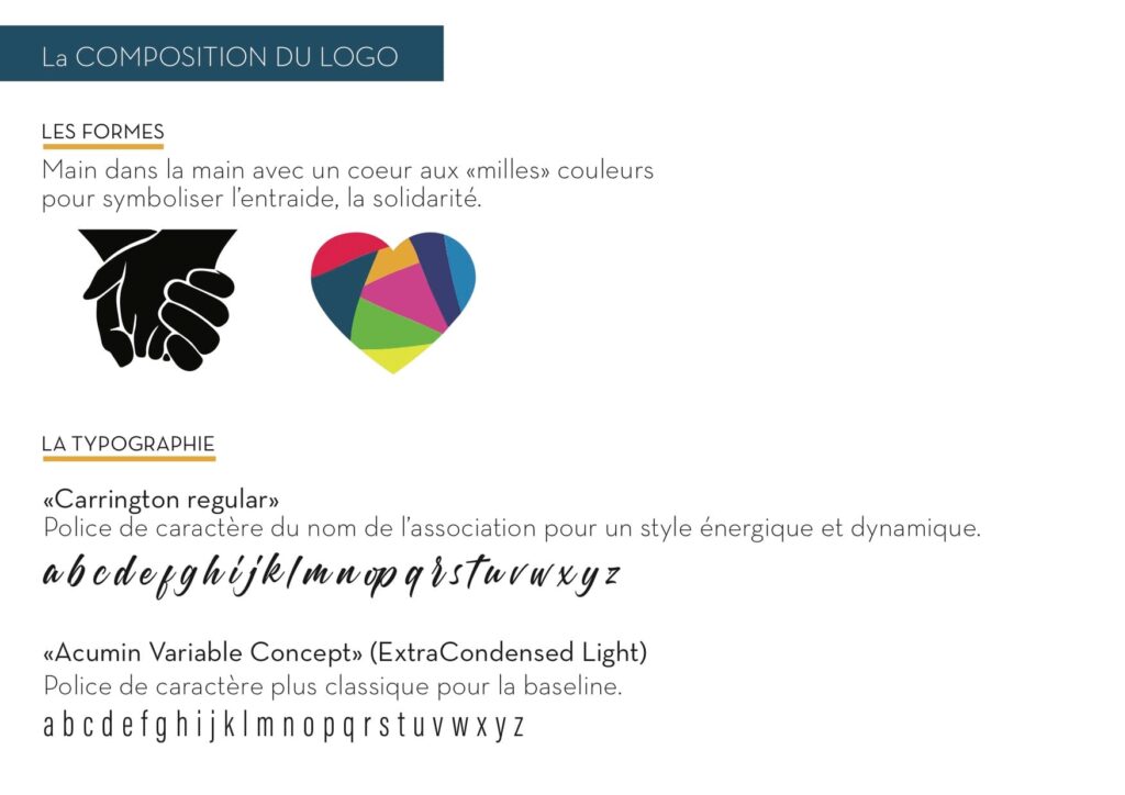
> Redesigning AMAOS logo,
> Redesigning AMAOS home page & and create a landing page. Desktop, Tablet and Mobile sizes.
> My goal when redesigning the logo and the home page was to make something colorful. Just because it’s a charity doesn’t mean people feel pity. Once exception was made for the donation landing page, I tried to convey a strong message with a powerful black & white image combined with dynamic font colors.
